This project was a standout moment of growth for one of my emerging designers. From concept to execution, the vision was clear—and flawlessly carried through. I was proud to support and see a true design breakthrough take shape.
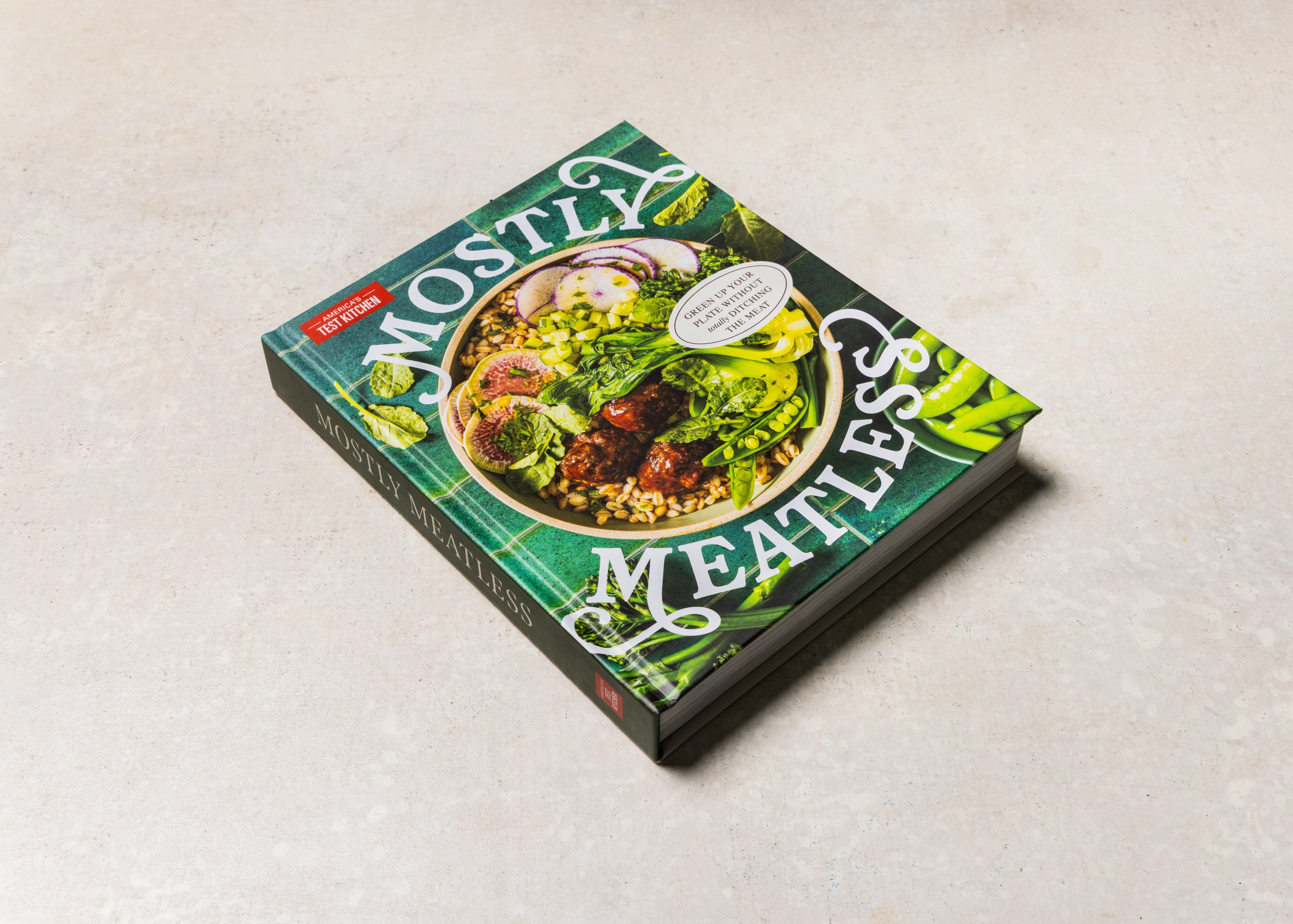
Cover Design
The cover is bold and inviting: a lush bowl of food bursting with appeal paired with playful typography that complements the title. The rich jewel-toned green grabs attention while nodding to the plant-forward theme. The interplay between the casual font and our established logo strikes a balance between fun and brand credibility.
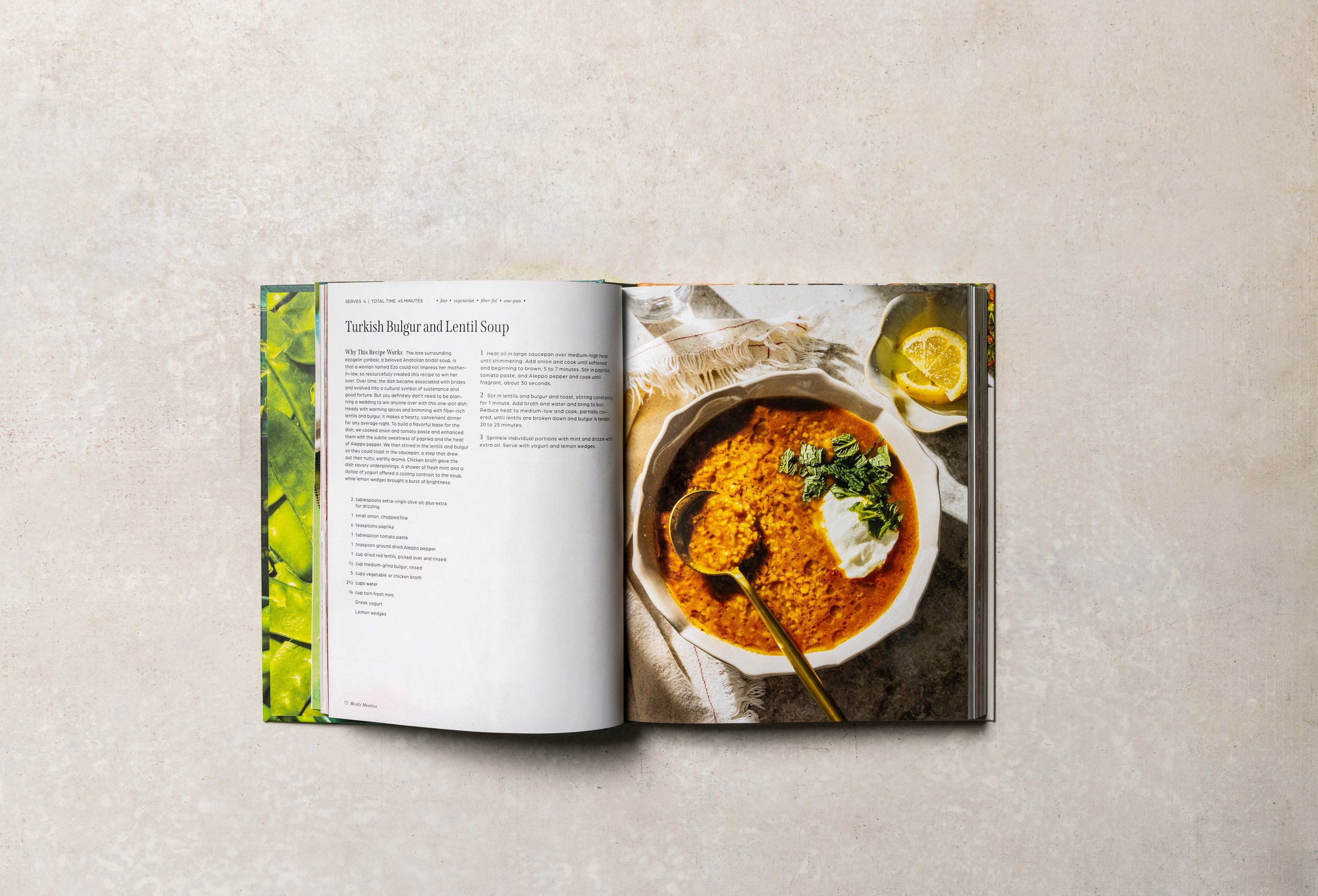
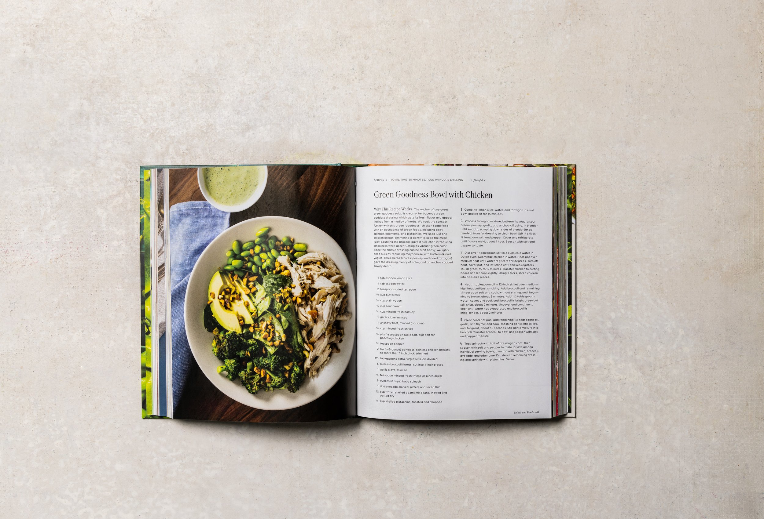
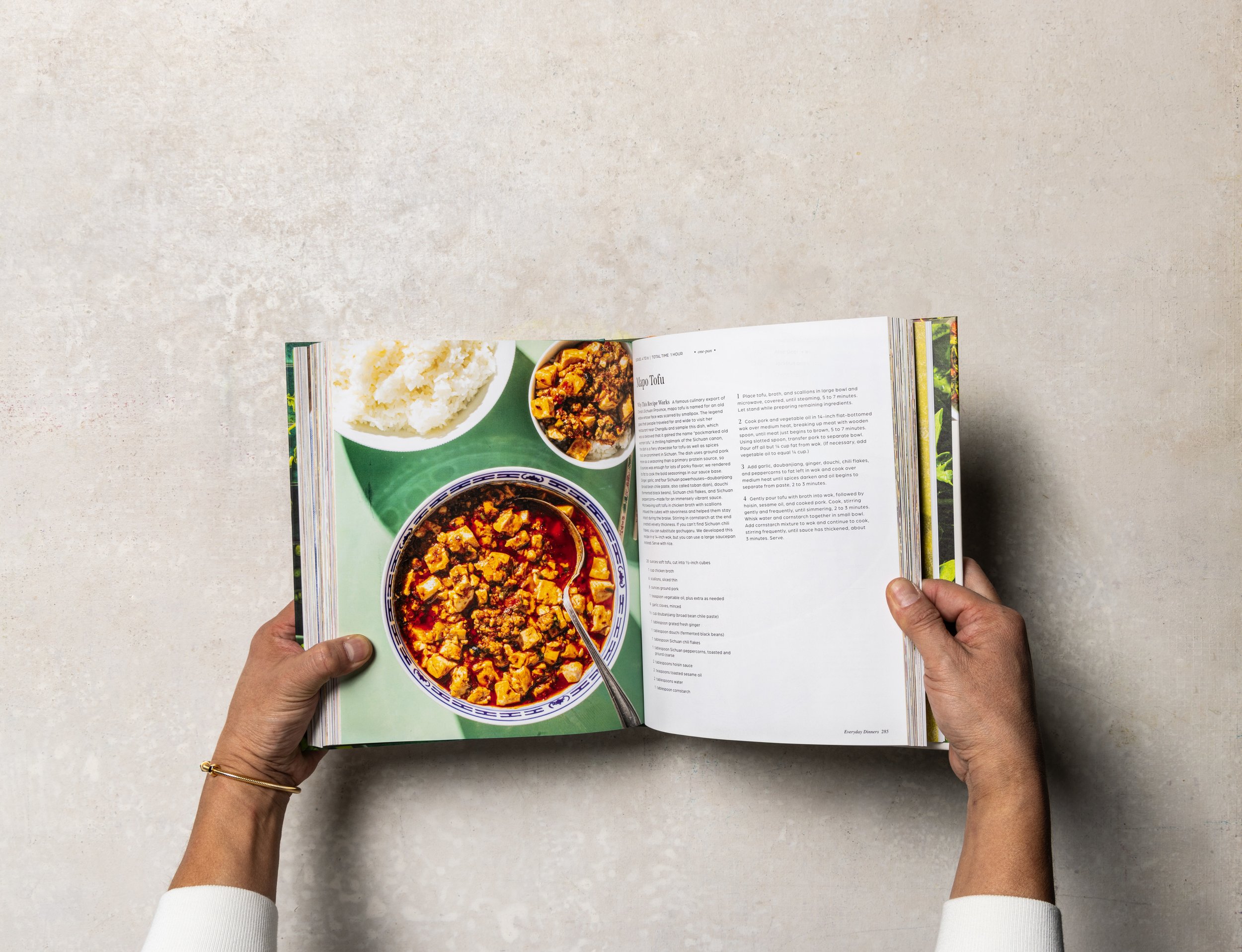
Photography
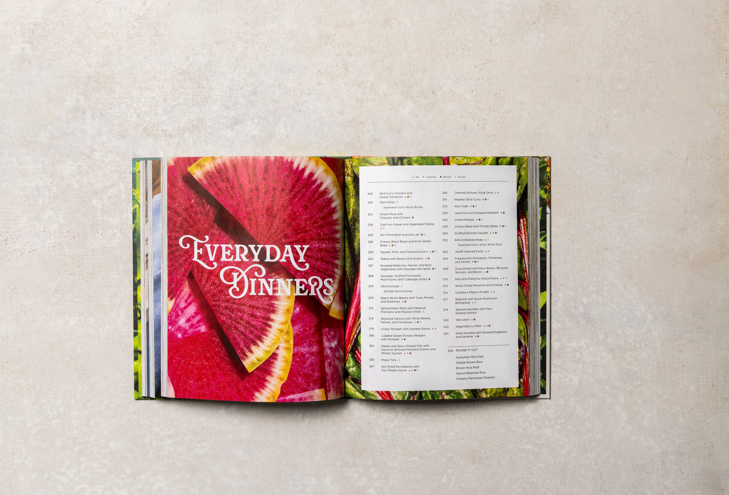
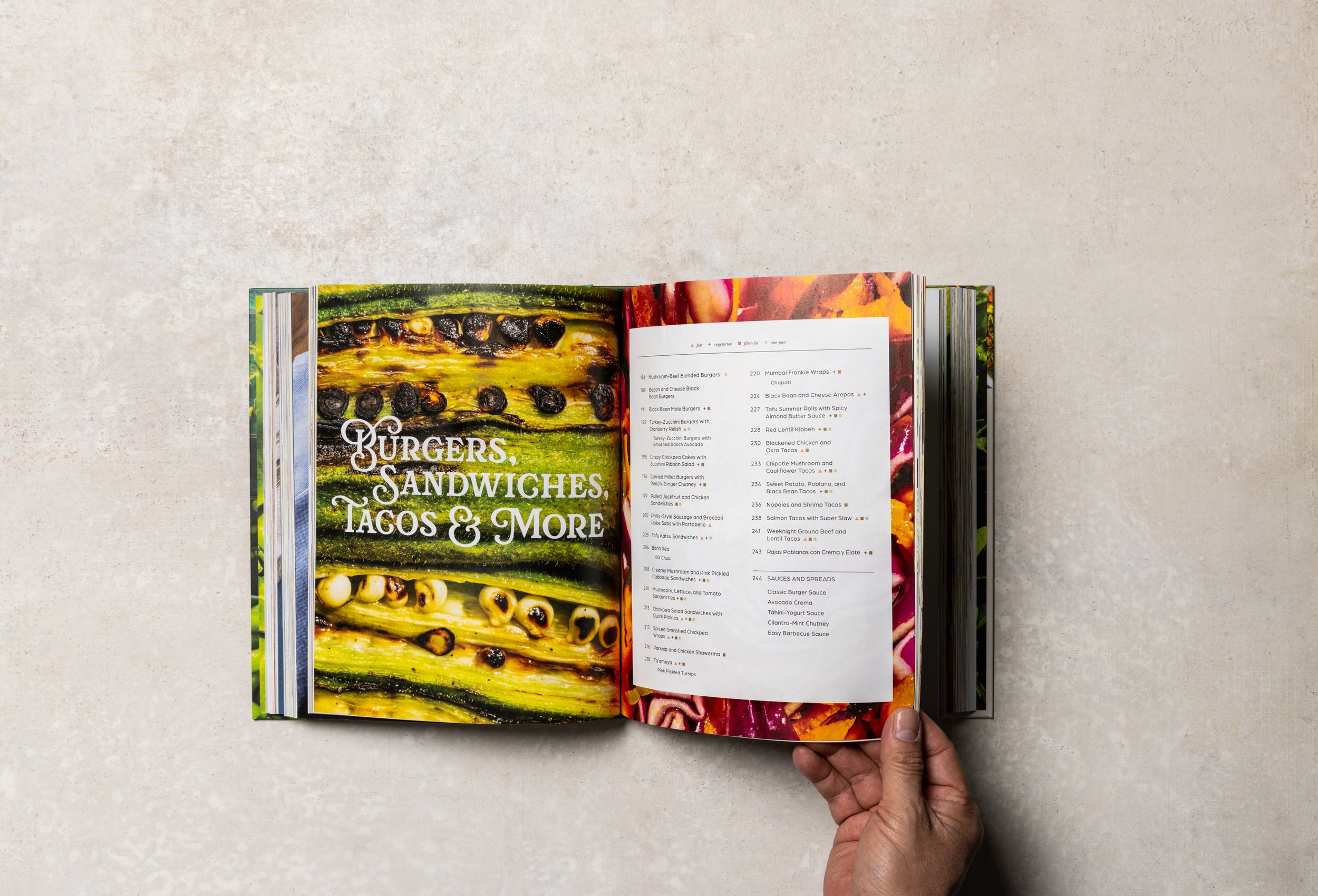
The photography direction leans into simplicity—letting the food speak for itself. Clean, natural styling showcases each dish, while macro ingredient shots at chapter openers create visual drama and celebrate the raw beauty of the food.
Interior Design
Inspired by editorial periodicals, the interior design is structured yet expressive. A hardworking body font and a serif with subtle personality ground the content with confidence, while playful chapter openers bring moments of surprise and joy throughout.